Proclaims (professional claims services) is an insurance claims company. they had last updated their site in 2015 and approached us for a redesign. They also required some updated branding.
BEFORE
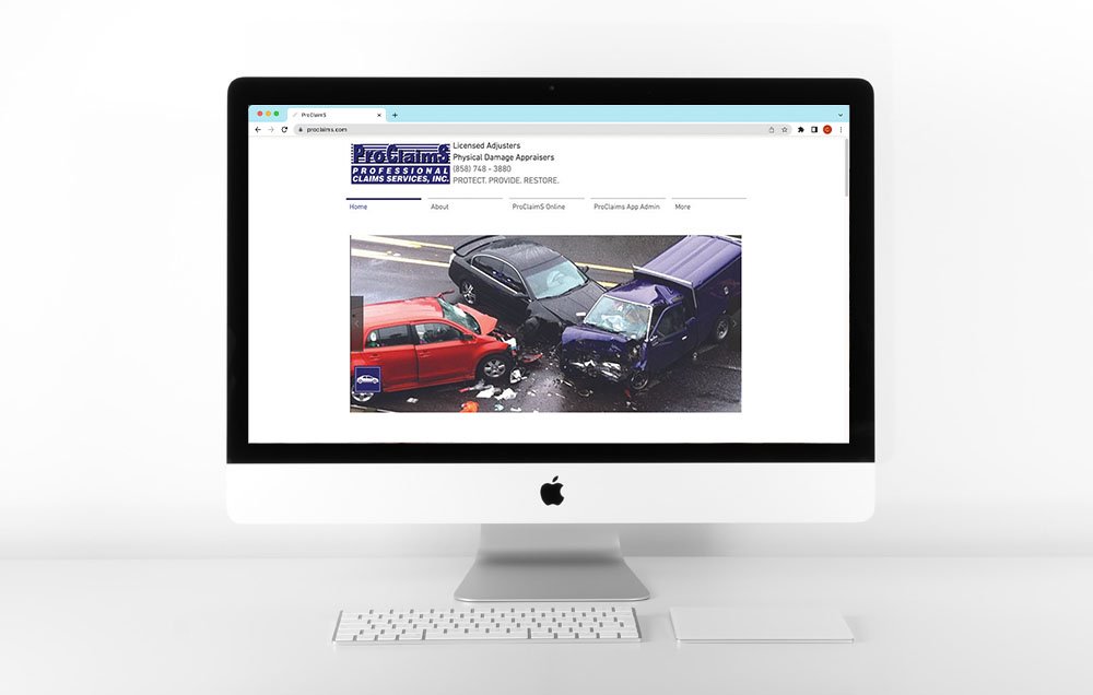
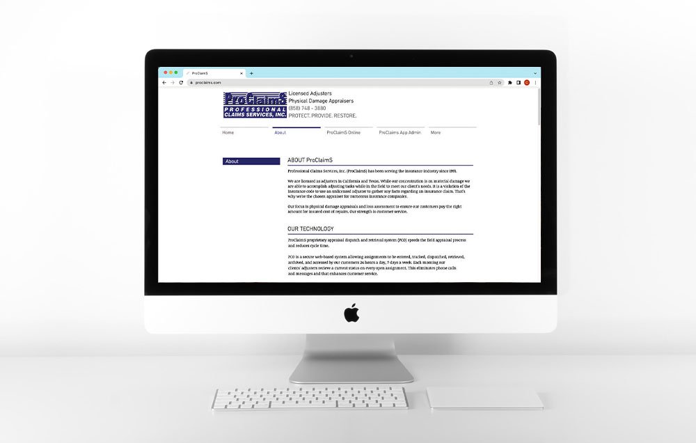
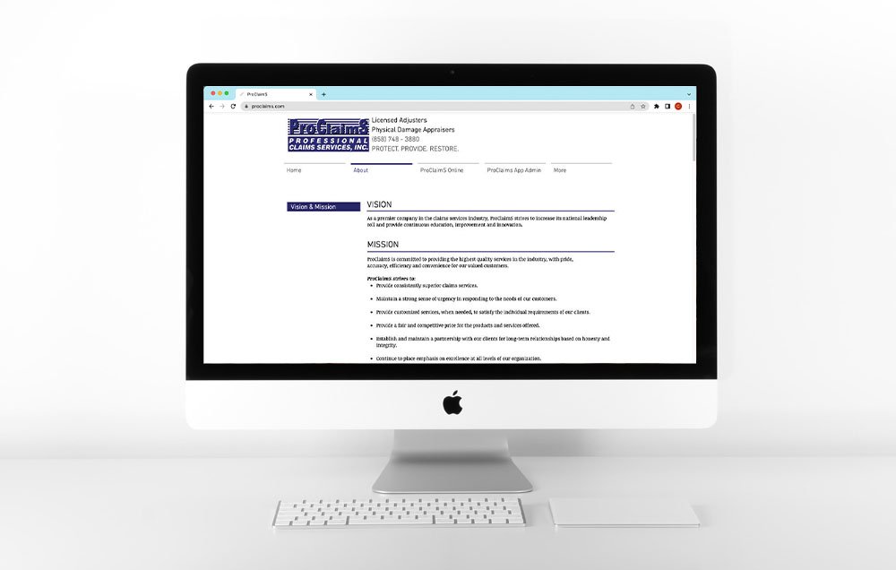
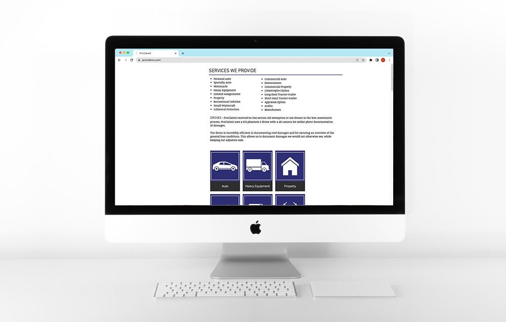
The site was and is more informational in nature. The homepage included photos of damaged property, outdated icons, and social links that did not connect anywhere. Most pages did not include visuals and it seemed there were more pages than necessary, some simplification was necessary. Here are visuals of the website when we got started.


AFTER
We gave the website a new look and feel. Taking imagery that showed a more positive light on the situation. Allowing the viewer to feel the trust of the company. Showing people that are taken care of and in a positive light gives the brand a sense of security.
We also expanded on the About Us page, rather than having multiple pages, this allows for an easier user experience. Customers no longer have to search all over for information. We updated the dark blue squares to allow for a more visually friendly light blue.
The flow of the website was important as well as considering all the visuals that we could incorporate to have a welcoming feel for the viewer.
You can view this site at proclaims.com.
Branding
This website also required updated branding. The logo was out of date and the brand guidelines needed a refresh. We created a new logo, keeping the idea of the lines but considering the look of a road as well. ProClaimS is all about getting their clients back on the road, back to their lives, and we wanted to show this in the logo. We also wanted to modernize it with an updated logo type and a mark that we could use sparingly as well.


